What’s a “Good” Conversion Rate and How Do You Get One?
A lot of people who are looking to give you advice about your WooCommerce site will talk to you about conversion rates.
They’ll tell you to improve them, obviously, because having high conversion rates are a good thing, so they say.
But what the heck is a high conversion rate, anyway?
The problem is that a conversion isn’t as easy to pin down as you might imagine. A conversion is any desired action taken by a user, which can include subscribing to your newsletter, submitting a contact form, purchasing a product, or could literally be any interaction that’s more than a visit to a static page, if you wanted.
But does that mean you’re looking for a 100% conversion rate for everyone coming to your site? How about 50%? 10%? 1%? Do certain types of conversions matter more than others? What if people are just submitting contact forms but you really want them to be purchasing your products? What if you have a 10% newsletter subscription rate but only a 3% cross-selling conversion rate? Are you still successfully converting?
First, take a breath, because that’s a lot of questions and you must be winded. Second, we’re here to help you sort it all out, so let’s dive in…
Measuring Conversion Rates
To answer one of the above questions: yes, the types of conversions matter. At least, they’ll matter to you. If you want your visitors to be purchasing products but all they do is sign up for your newsletter, you won’t be happy – even if you have 100% of your visitors signing up.
Ultimately, you want people to be converting in the areas that actually benefit you, but you won’t really know what those areas are until you start tracking your site as a whole.
So, the first thing you’ll want to do is look to see what actions (conversions) are currently taking place on your site, and then determine what actions you want to take place on your site and make changes to connect the two together.
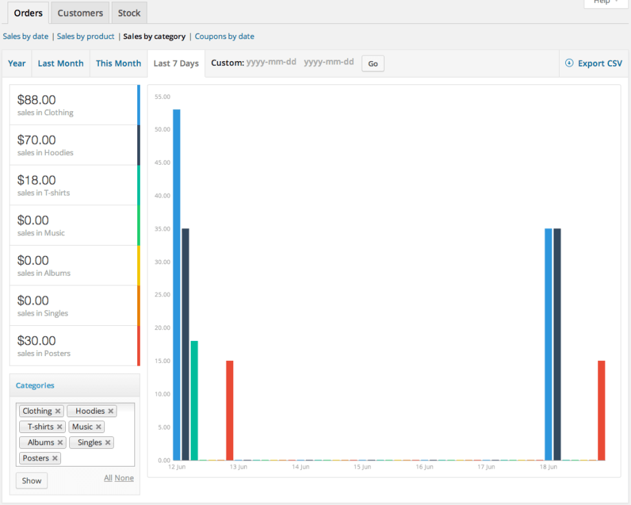
The good news is that WooCommerce already comes with reports that help you calculate interactions on your site, and if you want some additional firepower you can also use Google Analytics to refine that data further.
You’ll want to look for total number of unique visitors (called “Users” in Google Analytics) as well as the number of actions taken in a specific area – like overall sales in the month of July, or the number of new subscribers to your newsletter.
Then, divide and multiply: Conversions / Users * 100 = Conversion Rate
For example, if you had 125 new orders in July, and 8,000 unique site visitors for that month, your total conversion rate for sales would be roughly 1.5%.
You can do this for each of the subsequent areas of action around your site, and that should give you a sense of your total current conversions. You can also automate this process using a free WooCommerce plugin called Enhanced Ecommerce Google Analytics for WooCommerce.
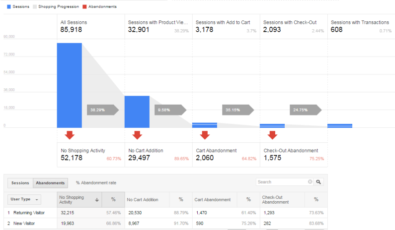
But Is That Number Good or Bad?
Now, you might be thinking that a little over 1% sounds like a terrible conversion rate, but it’s actually in the standard ballpark (though a little on the low end depending on the area).
Most industry leaders consider 2-3% to be the average conversion rate for online stores, meaning that 20-30 people out of every 1,000 visitors should take an action. You might also find reports saying that 5% is more accurate for eCommerce stores, while 1% is still an acceptable rate.
[Tweet “20-30 people out of every 1,000 visitors should take an action.”]
Either way, a “good” conversion rate doesn’t have to be in the double digits to be effective, but your goal should still be to work toward a conversion rate that’s higher than your current rate. Even a 1% lift from 2% to 3% can mean 50% more revenue for the same amount of traffic.
Of course, the 2-3% is just an average for your overall conversion rates, but in terms of what makes a good rate for specific commerce-related areas of your site, here’s what you’re looking for:
- Product Conversion Rates: above 5%.
- Cart Abandonment Rates: below 70%
- Checkout Abandonment Rates: below 75%
- Mobile Conversion Rates: half of your overall rate
Ideally, if you can get higher than 2-3%, that’s awesome and definitely possible. 5% is a solid benchmark, and we’ve seen sites as high as 20-25%. Of course, those are champions, so don’t fret if you aren’t there!
Get Conversions Where You Want Them
Once you’ve gathered all of your data and you can see where your conversion rates are strong and where they may be faltering, you’ll probably be wondering how to boost those rates a little bit higher.
While it’s true that there are many different variables that affect conversions – such as sign design, loading speed, product demand, and more – there are also things you can do to improve those rates in each area.
Watch Your Bounce and Exit Rates for Clues
Beyond watching the conversion rates above, you also want to measure similar data like bounce rates and exit rates as well as average session duration.
Your bounce rate is the percentage of people who leave after viewing a single page, which is usually because they’re not finding what they want on your site. You can reduce your bounce rate (and improve conversions) by:
- Including product tags for better searchability
- Highlighting products on different landing pages
- Making categories readily available on your homepage
- Creating more categories for easier searching
- Making sure your site is loading quickly
- Avoiding a hard sell
Your exit rate is the percentage of people who leave after viewing your site without taking an action, and your analytics reports will let you know the last page they were on before they left. If you have a high exit rate for a certain page, that’s a red flag, but in general you can also do the following to minimize your exit rate:
- Include a strong CTA on every landing page
- Include visual cues and symbols to direct people to take action
- Use clear navigation to help them find what they’re looking for
The average session duration gives you a general idea of how long people are browsing your site. A high bounce rate with a low average session duration means that your pages aren’t grabbing the right sort of attention.

You can help maximize conversions by:
- Simplifying your designs and including white space to draw attention to products, “add to cart” buttons and other CTAs
- Remove unnecessary elements that might distract or confuse visitors
- Use sharp images that grab the eye for both product pages and landing pages
- Provide important information and explanation for confusing products/features of your site on the whole
By improving the overall experience of your storefront you’ll minimize your bounce and exit rates and improve conversions rates, too.
Look at Your Sales Funnel for Clues
Technically, all conversions aren’t created equal.
There’s a difference between what is considered a “micro-conversion” (e.g. a newsletter) that would happen at the top of your sales funnel, and a stronger conversion that happens near the bottom of the sales funnel, like a purchase.
If you’re noticing more newsletter subscribers but your actual sales figures haven’t improved, it could be an indicator that your tactics are being focused in the wrong place.
While a micro-conversion is still good because it leads your users further into the funnel, you want to make sure that your conversions are strong from top to bottom to maximize effectiveness.
Final Thoughts
Be sure to watch your metrics on a daily or weekly basis, look for red flags on certain products or landing pages that might be causing low conversions, and make any necessary changes as needed.
Determine which specific actions you want your users to take and then create design elements that help them make that action, whether it’s subscribing to a service or newsletter or purchasing a product.
Oh, and don’t freak out if your rate seems low at first. Remember that 2-3% is normal, and you can always improve it over time.
